City Survey Program
My current research project aims to reframe how researchers and the broader public think about the processes through which racial inequities have been continuously reproduced in sub/urban spaces through time. As part of this effort, I have focused on HOLC’s “City Survey” program, which was instituted by the US federal government in partnership with the real estate industry during the late 1930s to map and grade thousands of neighborhoods in over 200 cities across the country (see images below). The infamous A-to-D grading system used to generate the maps reflected dominant ideas within the real estate industry about how various neighborhood features impacted the investment potential of its residential properties. Among other demographic, socioeconomic, housing, and locational characteristics, the visible presence of Black and non-white immigrants factored heavily in the grading process, leading many researchers to suggest that HOLC spearheaded the practice of “redlining.”
However, the precise impact these maps had on the sub/urban housing landscape remains hotly contested. In my critical reappraisal of the HOLC redlining debates in Urban Studies, I contend that the maps and their accompanying “Area Description” sheets are perhaps better seen as windows into the governing racial-spatial ideology of twentieth-century real estate capital rather than as objects that were literally used to make lending decisions.
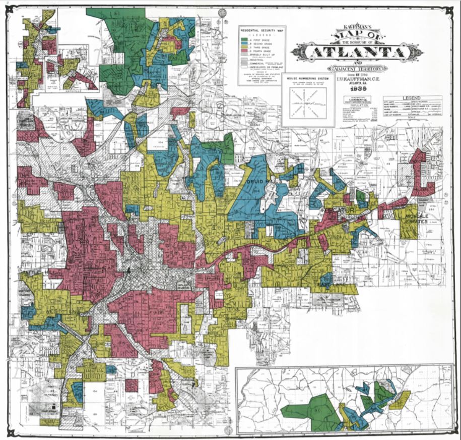
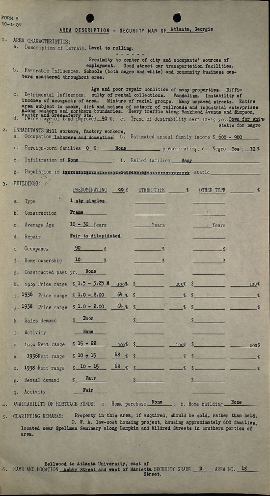 Source: Mapping Inequality
The Digital Scholarship Lab at the University of Richmond has made the HOLC maps and their field notes available for download as part of their Mapping Inequality project. They also make available a shapefile and GeoJSON file to allow for easy integration with most GIS software programs. Assisting this effort, I have converted the data in HOLC’s Area Descriptions into convenient, readable tables (available for download at Open Science Framework. HOLC variables such as the Black population percentage, “foreign born” population percentage and group, family income, occupation class, average building age, home repair status, and mortgage availability are fully ready to be downloaded and incorporated into statistical analyses, while users can conduct keyword searches with the remaining entries.
These variables can be seen in the interactive map below. All R code used to generate these files are available through GitHub, and a description of the background and methods is available at Environment and Planning B.
Zoom into a city and click on one of its HOLC neighborhoods to see its attributes. You can toggle the basemap by clicking the layer icon on the lefthand side. All variables used to populate these attribute tables are available here.
Map Zoom
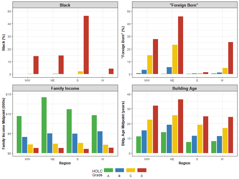
Using the data provided in the map, we can see the HOLC grading breakdown by variable and region. Despite some noteworthy regional variation, the Black population share, “Foreign Born” population share, and Building Age increase as the neighborhood grade goes from A to D, while Family Income moves in the opposite direction. This is expected, as these factors all played an important role in how lenders, real estate brokers, landlords, appraisers, and others dealing in real estate perceived an area’s potential returns on property investment. Specifically, the visible presence of Black residents in a neighborhood was widely assumed to be detrimental to property values. Accordingly, as the top-left panel suggests, almost all neighborhoods with any Black residents at all were assigned a D grade.
% Black, % Foreign Born, Family Income, and Building Age by HOLC Grade According to the Area Descriptions
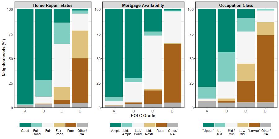
Additionally, we can see how some of the descriptive data breaks down by HOLC Grade. The figure below shows how Home Repair Status, Home Mortgage Availability, and Resident Occupation Class were districted by HOLC grade. Again, these distributions conform to expectations.
Home Repair Status, Mortgage Availability, and Occupation Class by HOLC Grade According to the Area Descriptions
We might also wonder about how HOLC appraisers issued neighborhood grades based on the presence of different “foreign born” groups. That is shown in the graph here, which enumerates the number of HOLC neighborhoods where each population group is at least mentioned.
Population Groups by HOLC Grade According to the Area Descriptions
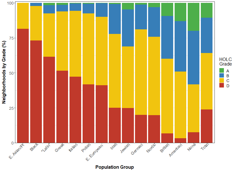
Notably, the relationship between grades and “foreign born” groups closely tracks the racist ranking system published by the influential land-use economist Homer Hoyt in his 1933 One Hundred Years of Land Values in Chicago. Here, Hoyt asserted that land values in an area went up or down depending on which of these populations lived nearby. Hoyt’s book was exceptionally well-regarded within the industry, and he would later serve as the head economist of the Federal Housing Administration (FHA). There, he was instrumental in the agency’s adoption of its own redlining maps and policies that were used to deny mortgages to non-white applicants.
Homer Hoyt's Ranking of Racial/Ethnic Groups by Their Purported Effect on Home Values in Chicago
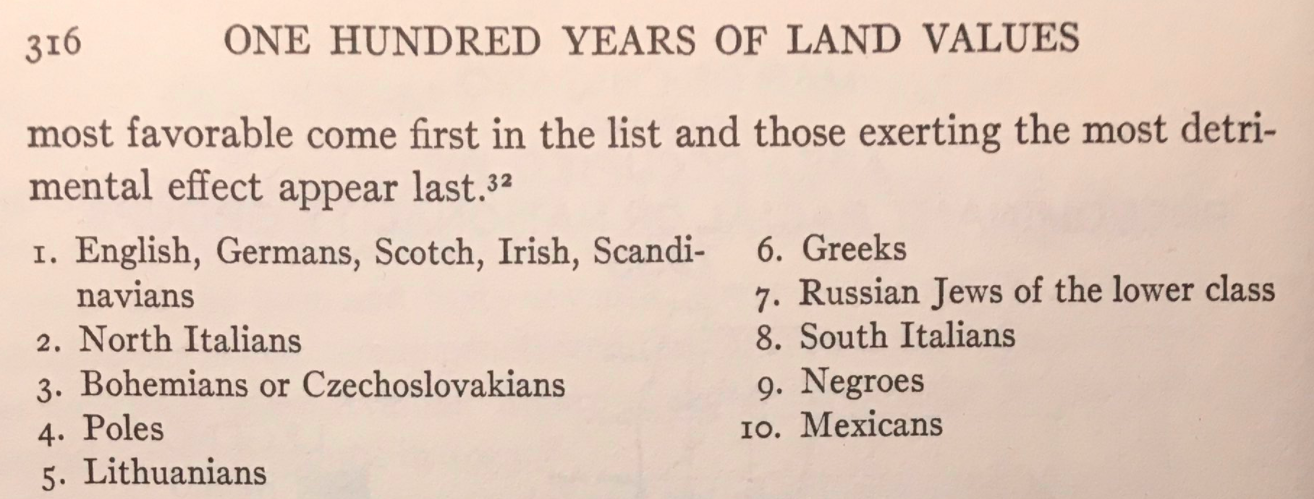 Source: Hoyt (1933: 316)